
Uwajimaya Rebrand
A complete rebrand of the Uwajimaya grocery chain intended to create a cozier, more intimate shopping experience while staying true to the store’s Japanese heritage.
Made in collaboration with
Haruka Sakamoto
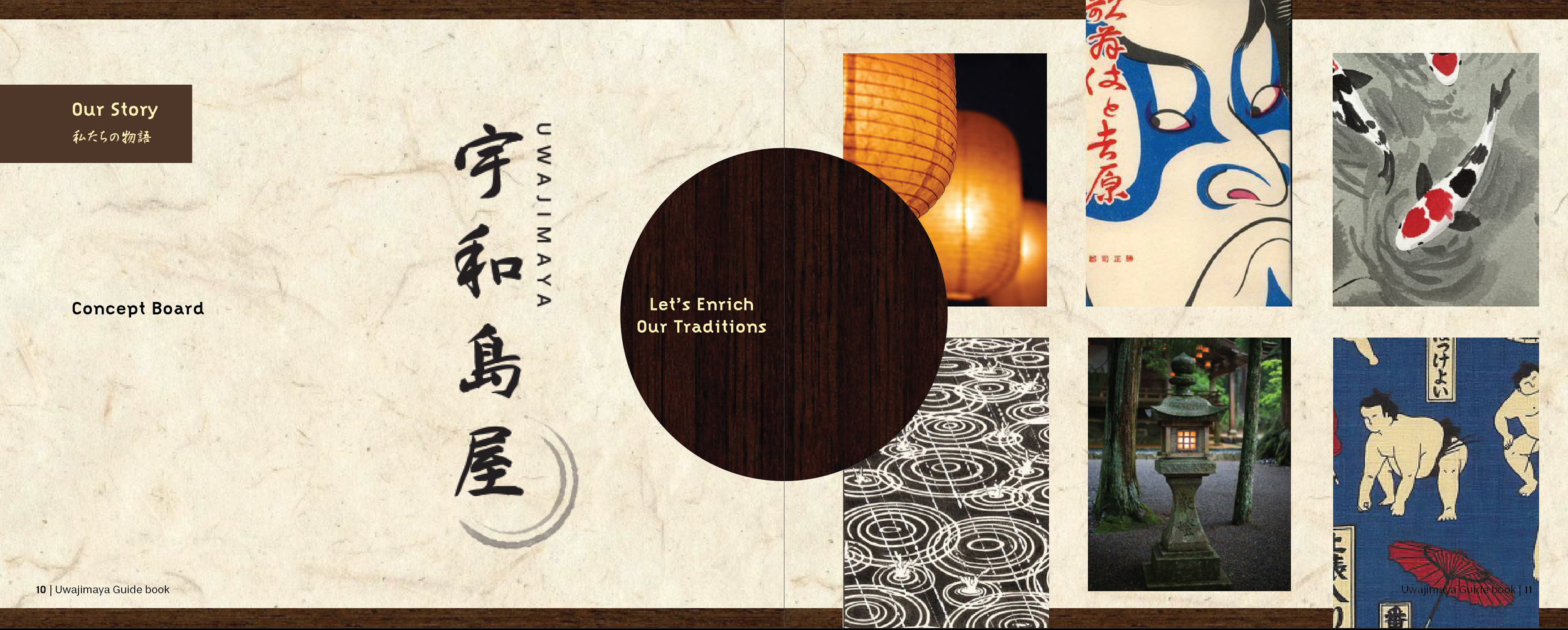
For this project, I teamed up with Haruka Sakamoto to present a rebrand, delivered as complete brand guidelines, for a local business. We chose Uwajimaya. The Japanese grocery chain recently rebranded toward a more minimalist look, think Apple or Uniqlo. We wanted to offer an alternative vision rooted in culture and aesthetics. It wasn’t just about bringing more Japanese tradition into the space but about creating an intimate warmth that felt like home or neighborhood. To capture that feeling, we studied traditional Japanese homes and adopted paper doors as a primary motif, using them to set the tone without letting them overtake the rest of the brand.
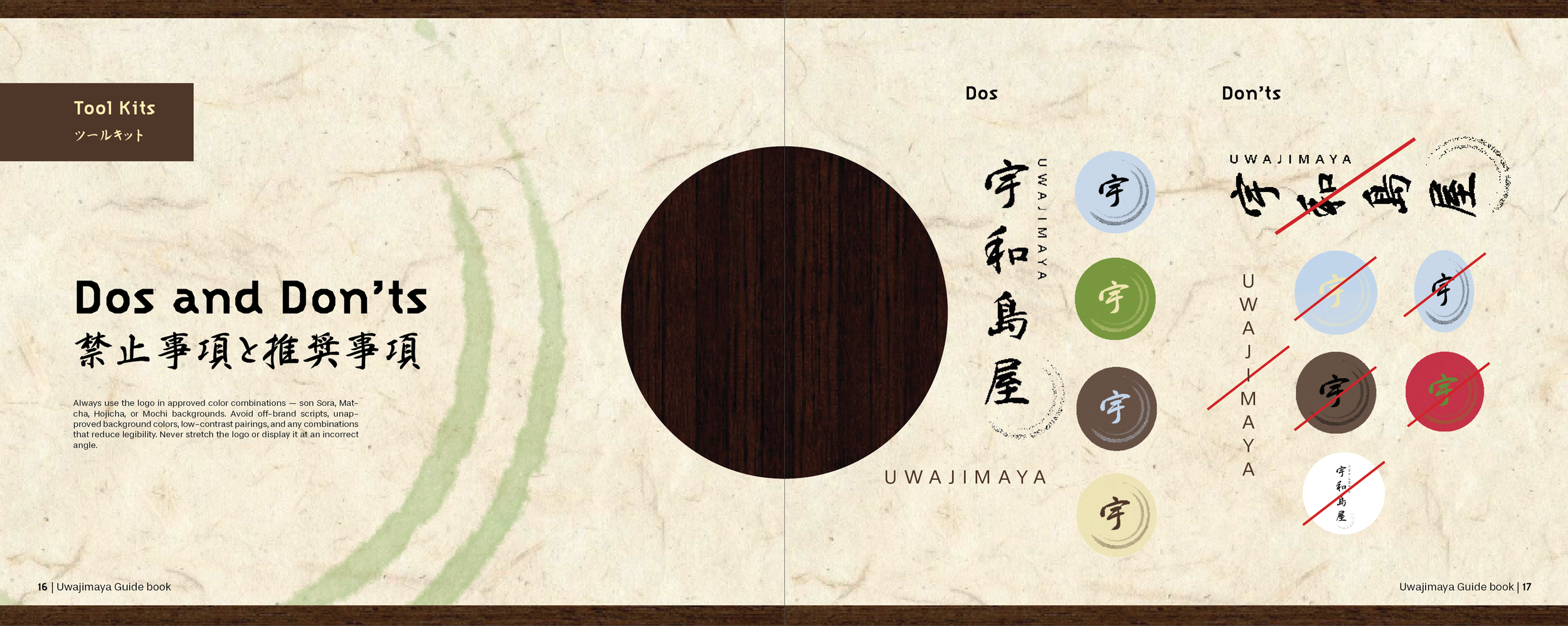
For the logo and typography, we designed for two primary audiences: native Seattleites and Japanese immigrants. We established an early rule that all headlines would appear in both English and Japanese. One key difference between the languages is that classical Japanese allows for verticality in ways English usually doesn’t, so much of this stage was spent writing rules for how the typography would work both horizontally and vertically.
One of Haru’s early pieces for the project was a set of employee uniforms featuring a fish design with circular brush strokes suggesting the movement of water. We loved the circular strokes as a repeating element and used them prominently in the logo, where they contrasted nicely with our otherwise square patterns and gave the brand a touch of elegance. This motif later informed the rules I wrote for photography: food presented either without backgrounds or inside circles, using the natural curves of plate ware to echo the circle motif.
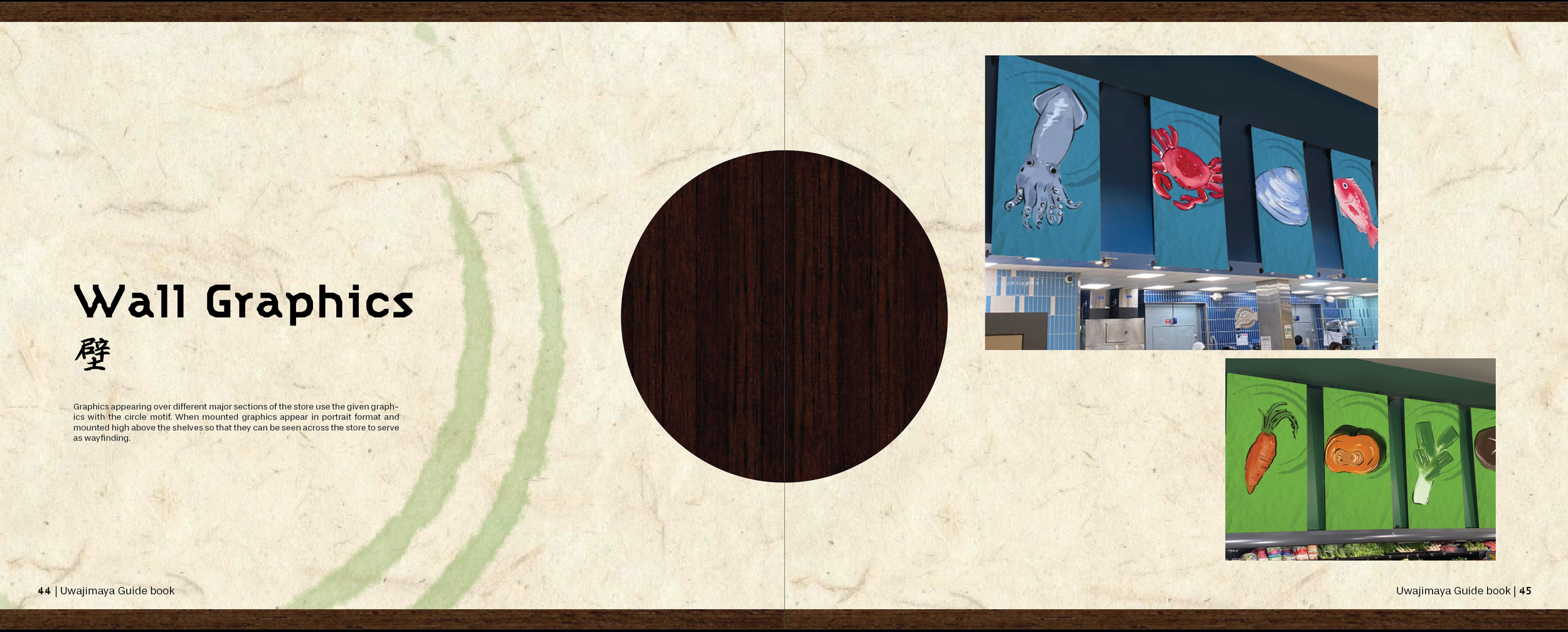
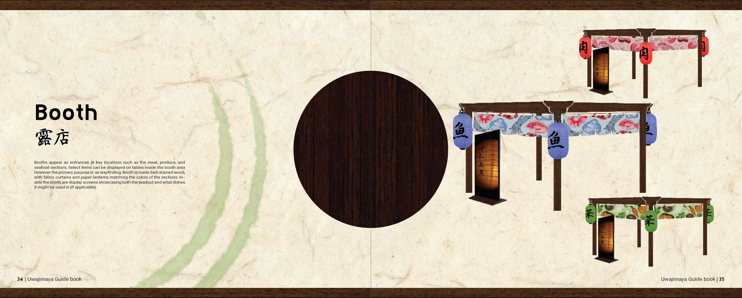
Across the project, Haru and I complemented each other's skill sets. She handled much of the hand-drawn illustration work while I was responsible for mockups in Photoshop. Haru would iterate on illustrations, and I brought them to a higher fidelity by using her illustrations and layouts to build full mockups. This made everything feel real.
Why It Matters
This is client-scale brand work. Delivering complete brand guidelines, not just a logo, mirrors what agencies and in-house teams actually produce: rules for typography, photography, motifs, and applications that dozens of future hands can execute consistently. Presenting a considered alternative to a company’s existing rebrand also demonstrates strategic positioning, the ability to argue for a direction rather than simply style one.
The bilingual typography system is especially relevant. Designing headline rules that work in both English and Japanese, horizontally and vertically, addresses a real and growing need as brands serve multicultural audiences, and it shows cultural fluency handled with respect rather than as surface decoration. Finally, the collaboration itself matters; clearly divided roles, iterative handoffs between illustration and mockup, and each partner elevating the other’s work is exactly how professional creative teams operate.
Process
Problem: Uwajimaya’s recent rebranding did not align with the experience of shopping there. How might we rebrand Uwajimaya to appeal to Uwajimaya’s customer base while honoring the tone of its roots.
Solution: Our primary approach when crafting the brand was a careful balancing of the characteristics we identified with the story being cozy with a harmonious atmosphere and a traditional Japanese aesthetic. To this end, we used primarily natural imagery and materials such as polished dark wood for a more approachable and traditional look. To bring in a sense of warmth, we used a lot of paper lanterns and door imagery, as when light shines through paper, it helps create a more intimate, homely atmosphere. The text we used had to bring a sense of Japanese traditionalism while maintaining approachability for an English-speaking audience, which led us to both a Japanese and English typeface for our headers. For added effect, we included vertical layouts for type. Finally, we stuck to a more natural color palette with earthier versions of green, red, and blue.
Research: We started by going to the store and then engaging in several branding exercises to nail down the characteristics of the company. We found the characteristics to be more cozy and harmonious while sticking close to its Japanese roots.
Collaborators: Haruka Sakamoto
Tools: InDesign, Photoshop
Roles: Guidebook Designer, Photoshop specialist (3D model rendering), environmental graphics