
BIOS Magazine
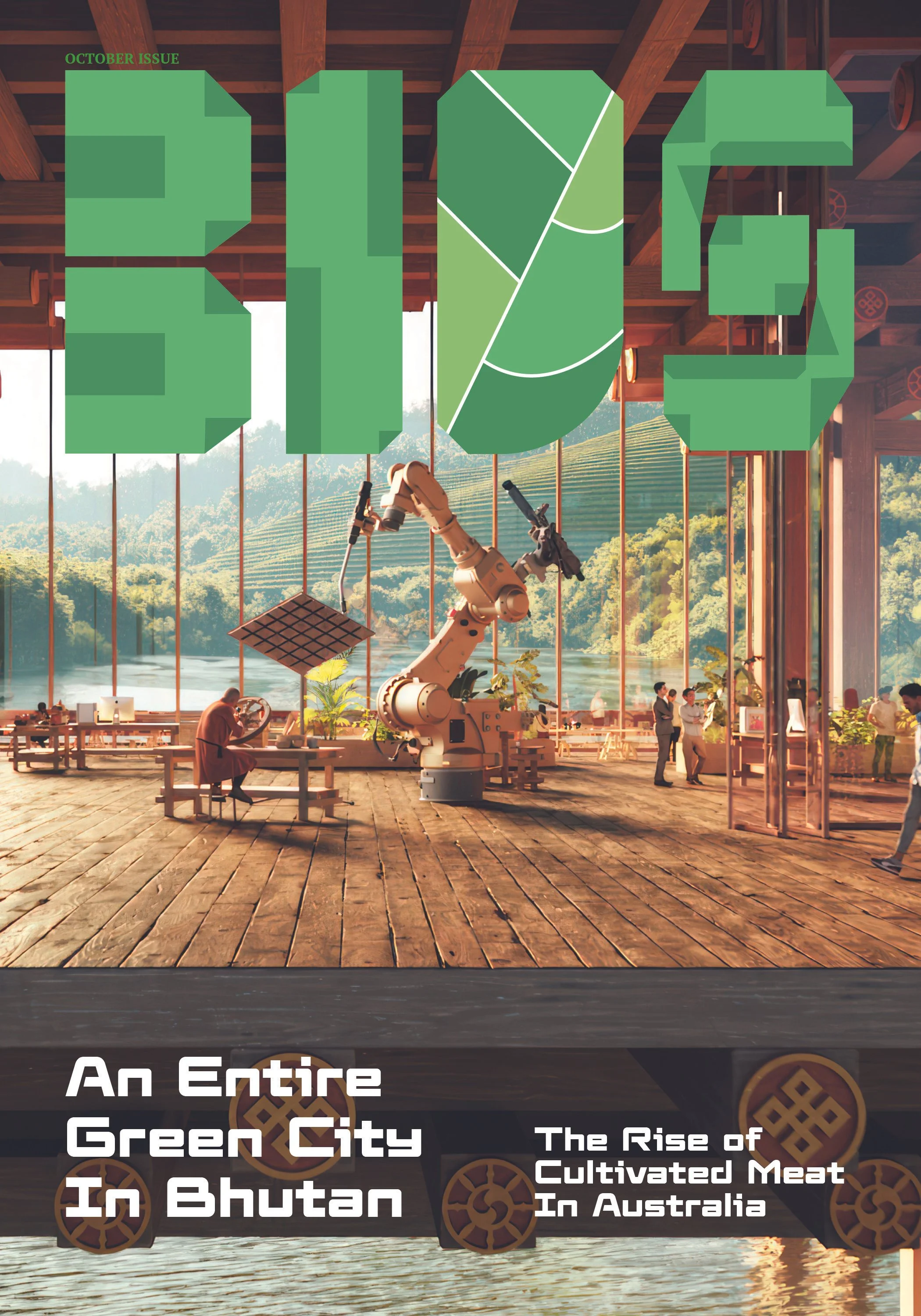
BIOS is a magazine designed and curated for news on environmentally friendly technology, and the companies involved with it. I made it to appeal to lovers of technology, the environment, and those who wish to be more conscientious with their investments.
When choosing my topic for the magazine, I had settled on green technology as a widely untapped market. There are, after all, plenty of technology magazines, each with a specific focus. However, I noticed a distinct lack of talk about ways we could leverage technology to make the world a better place. In a sea of constantly emerging tech trends, I wanted something with a highly positive use case. Early versions of my moodboarding process involved alternating natural and laboratory imagery. However, this approach was significantly altered as I spent more time studying existing tech magazines and collecting articles to use. I had found that when talking about academic subjects, layouts trended towards more of a research paper format than what you might expect in other kinds of magazines.
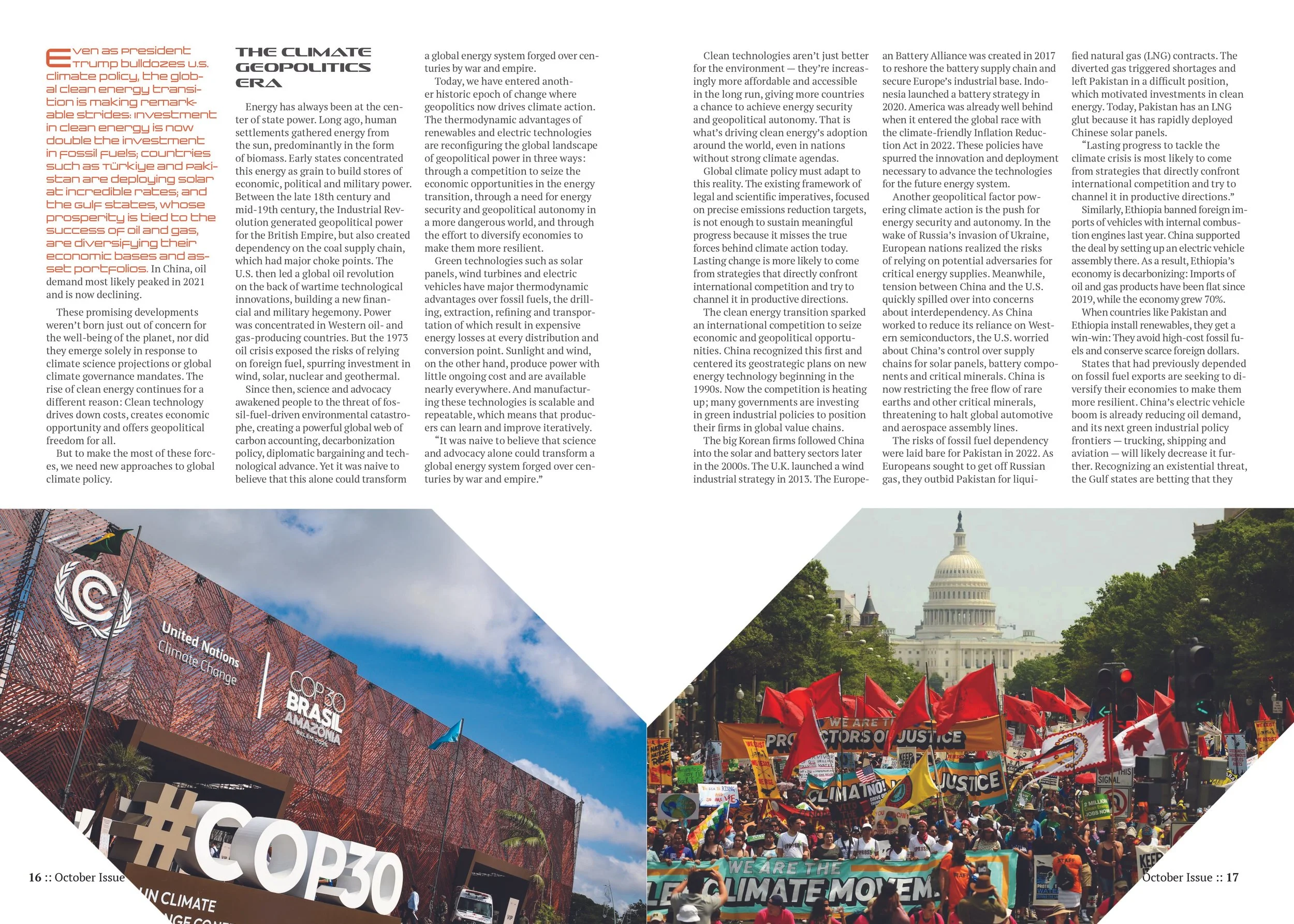
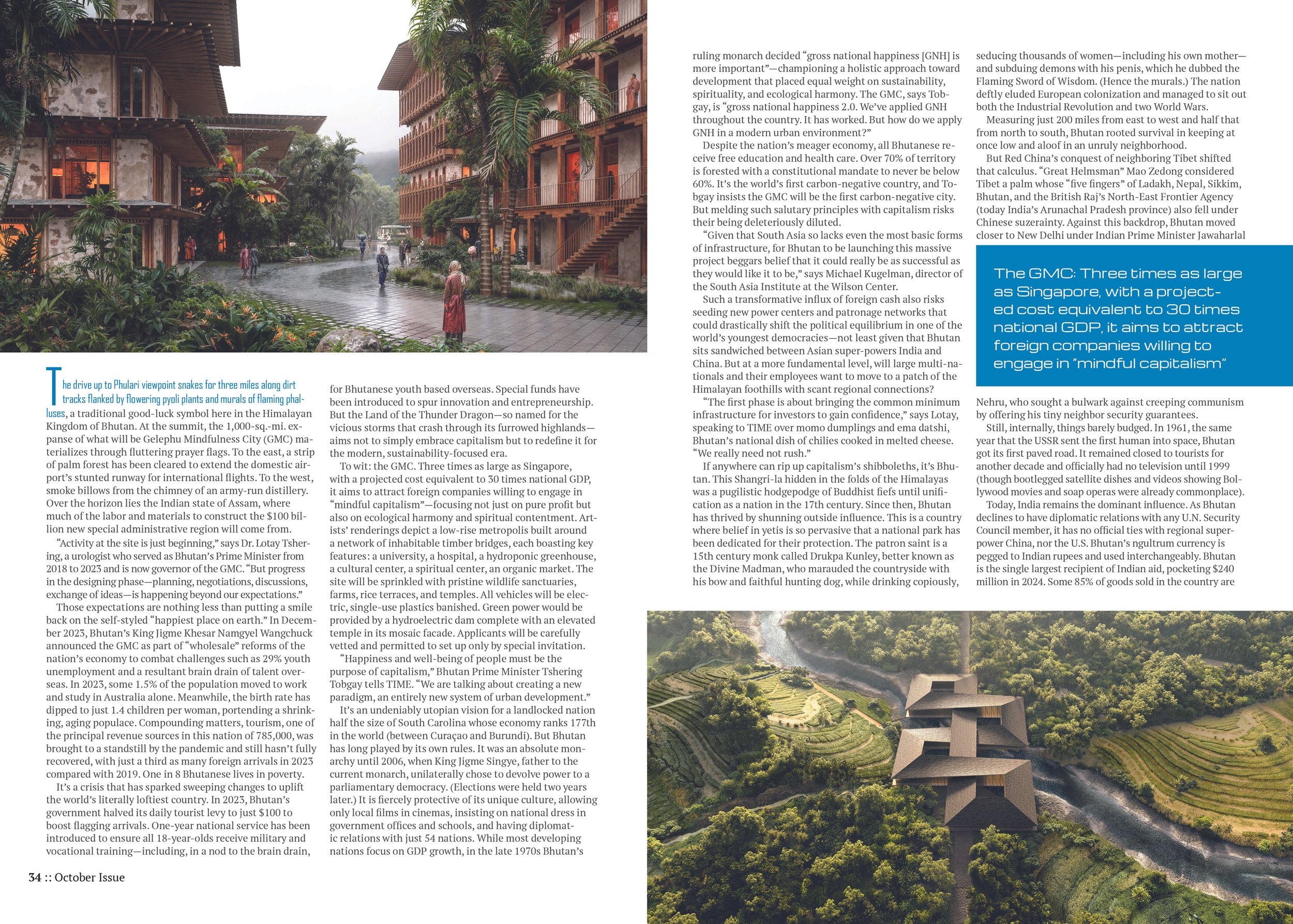
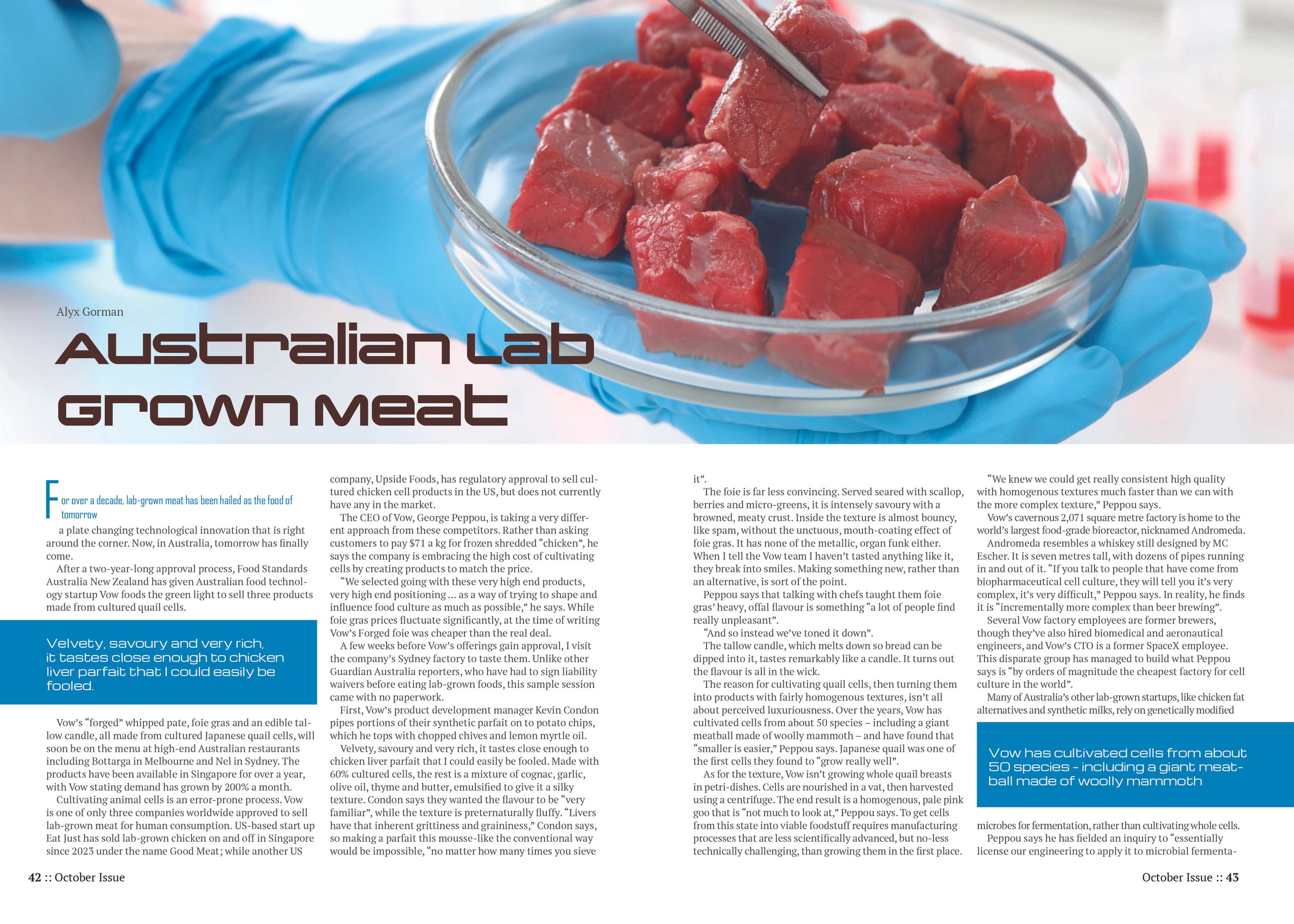
One of the biggest challenges I faced while making the magazine was finding ways to alternate the layout without breaking the otherwise strict rules. When I studied science and tech magazines, I found that they primarily used big eye-catching hero images with highly organized body text. I had to find new approaches to things like pull quotes and introduction sentences. I also wanted to make each article have its own personality and spent considerable time on the larger articles, focusing on unique ways I could treat photographs and imagery.
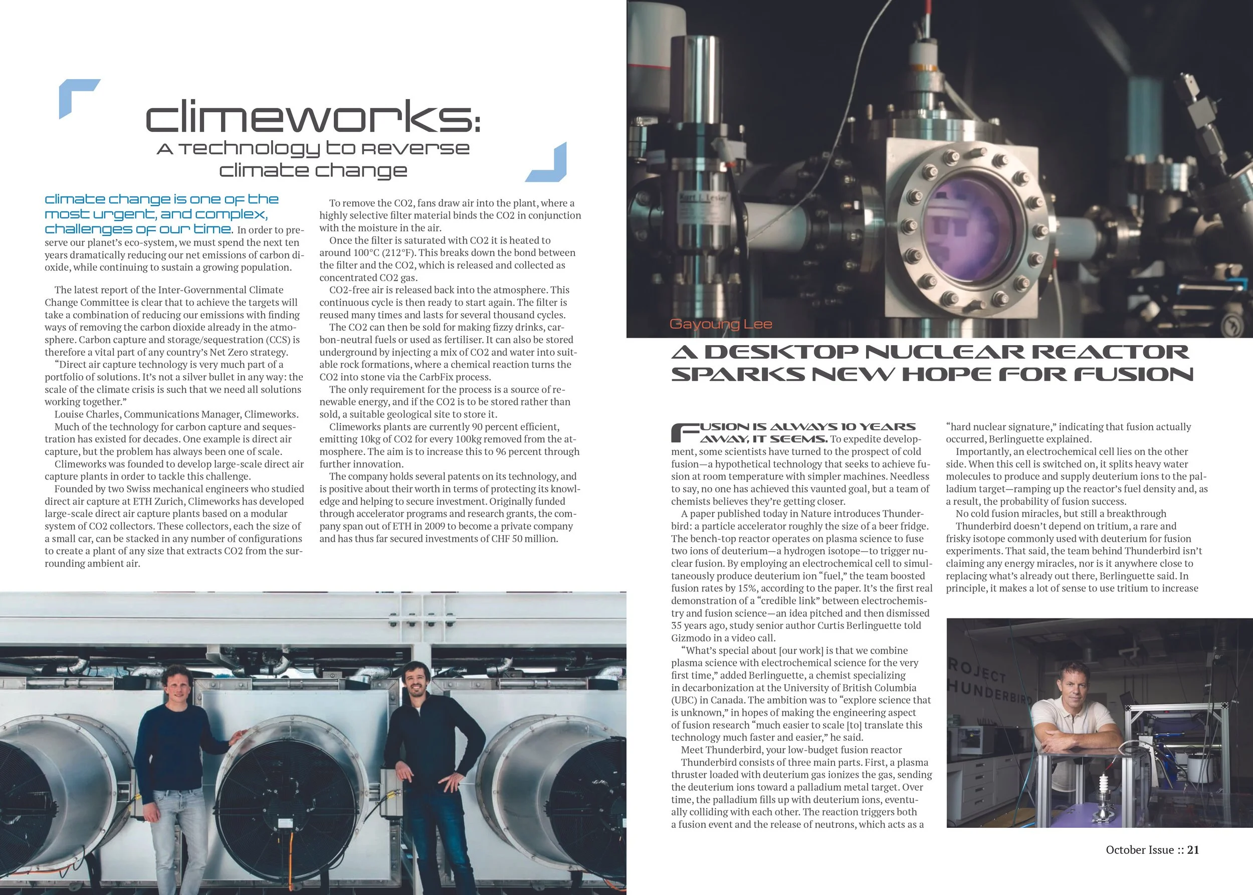
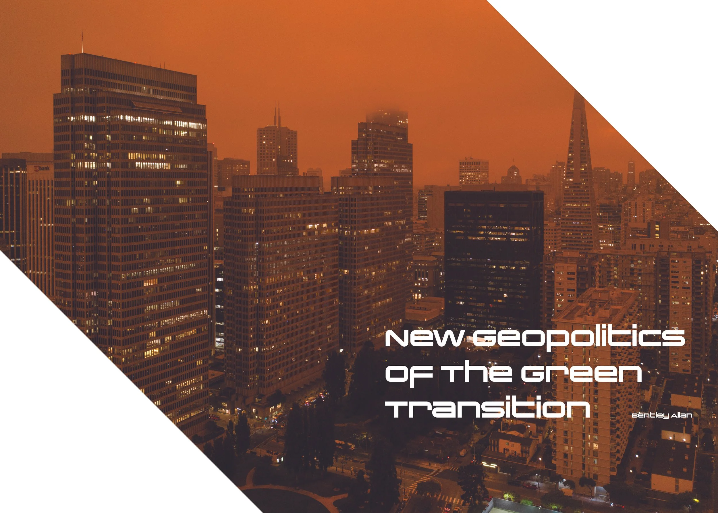
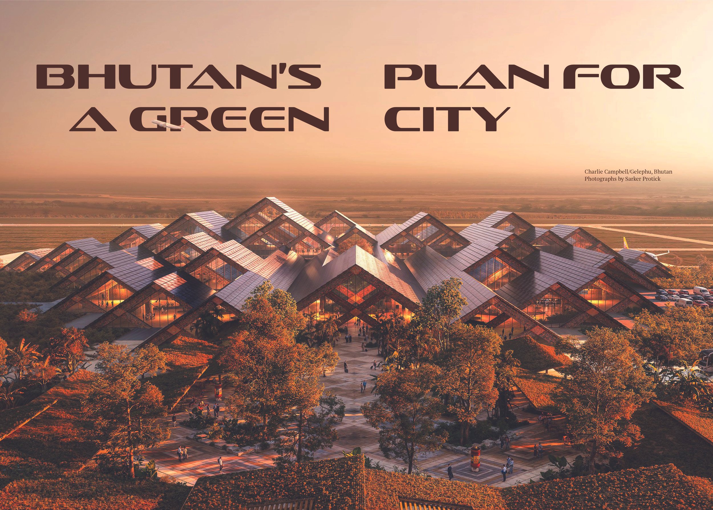
The earliest versions of every article started with a standardized template before I started making changes to each one. I wanted to ensure that I had my core rules in place before I changed too much. The first series of changes I made was for the article I was using as a cover story. Since it was a big article with very striking imagery, the focus was on making the pictures big. Every image in the article was treated as a hero image, while the actual hero image took up an entire spread. Other articles saw more radical changes in the form of different picture framing and consistent placement. While others used smaller pictures added in different locations on each page to break up particularly dense articles.
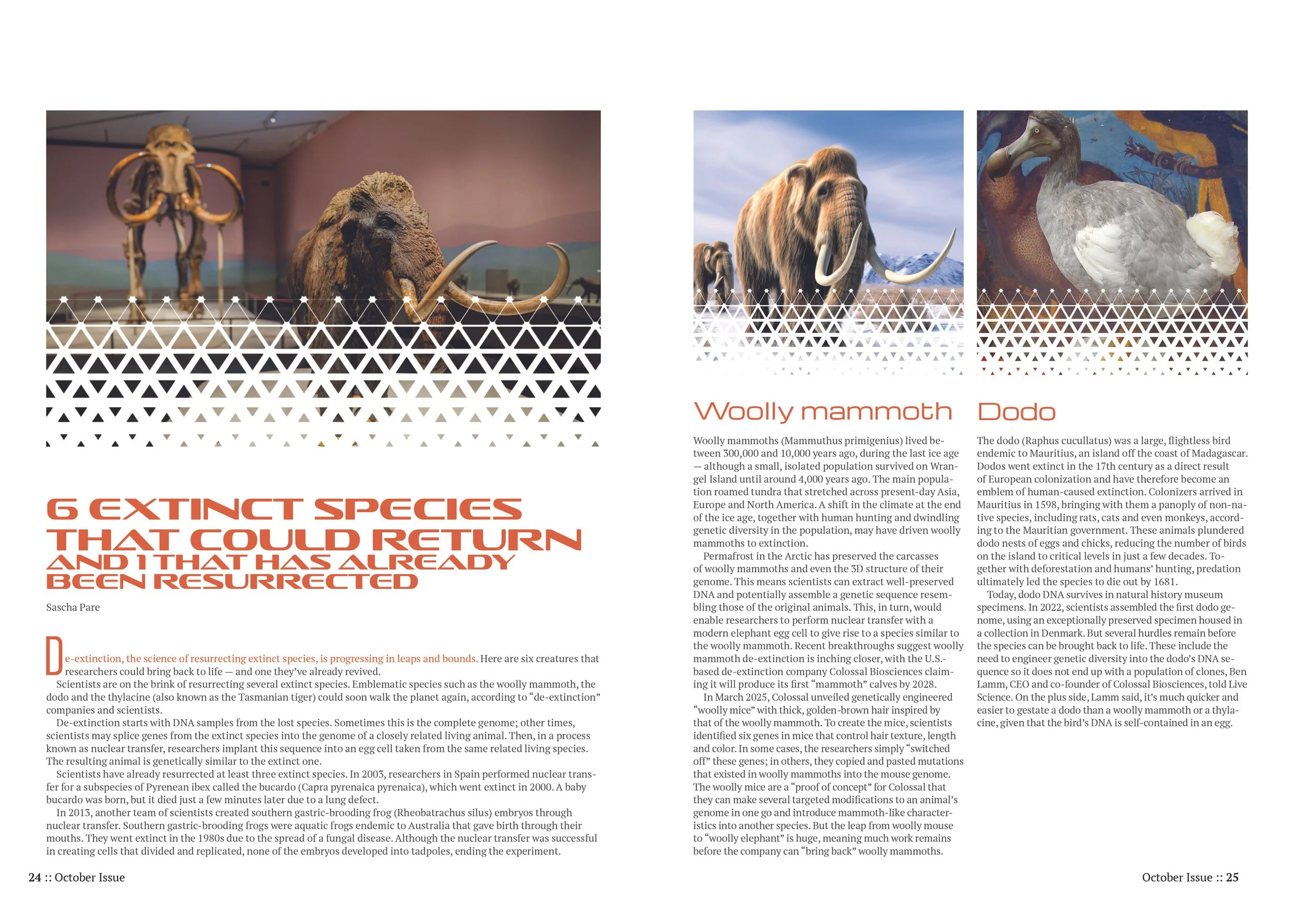
Why it Matters:
This project sharpened my ability to build a flexible design system that scales—establishing clear rules, then knowing exactly where to break them for impact. Researching genre conventions before subverting them shows I can balance brand consistency with creative differentiation, a skill that translates directly to managing multi-piece campaigns or product lines where every asset needs to feel connected but not identical. It's proof I can think in systems first, then design with personality second.
Process
Objective: Create a magazine and layout that appeals to readers interested in news pertaining to environmentally friendly technology and the companies making this technology. The goal is to have an informative end product that can both catch the reader’s attention and keep them reading through information-heavy articles.
Solution: Following the findings of my research, I started each article with big full-page pictures and headlines before slowing down to a cleaner, academic layout for the body copy. Bigger articles would be introduced with hero images across full spreads instead of a single page for added impact.
Research and demographics: Key research was primarily focused on the layouts and stylings of other academic magazines. I found that a lot of articles in these styles of magazines would use big, eye-catching headlines and images to grab the attention of the reader before shifting to a more accessible format for the body.
Solo Project
Tools: InDesign, Photoshop
Length: 3 months (October-December 2026)
Roles: Research, Editor, Designer, Brand developer