
Pelican
Gig Poster
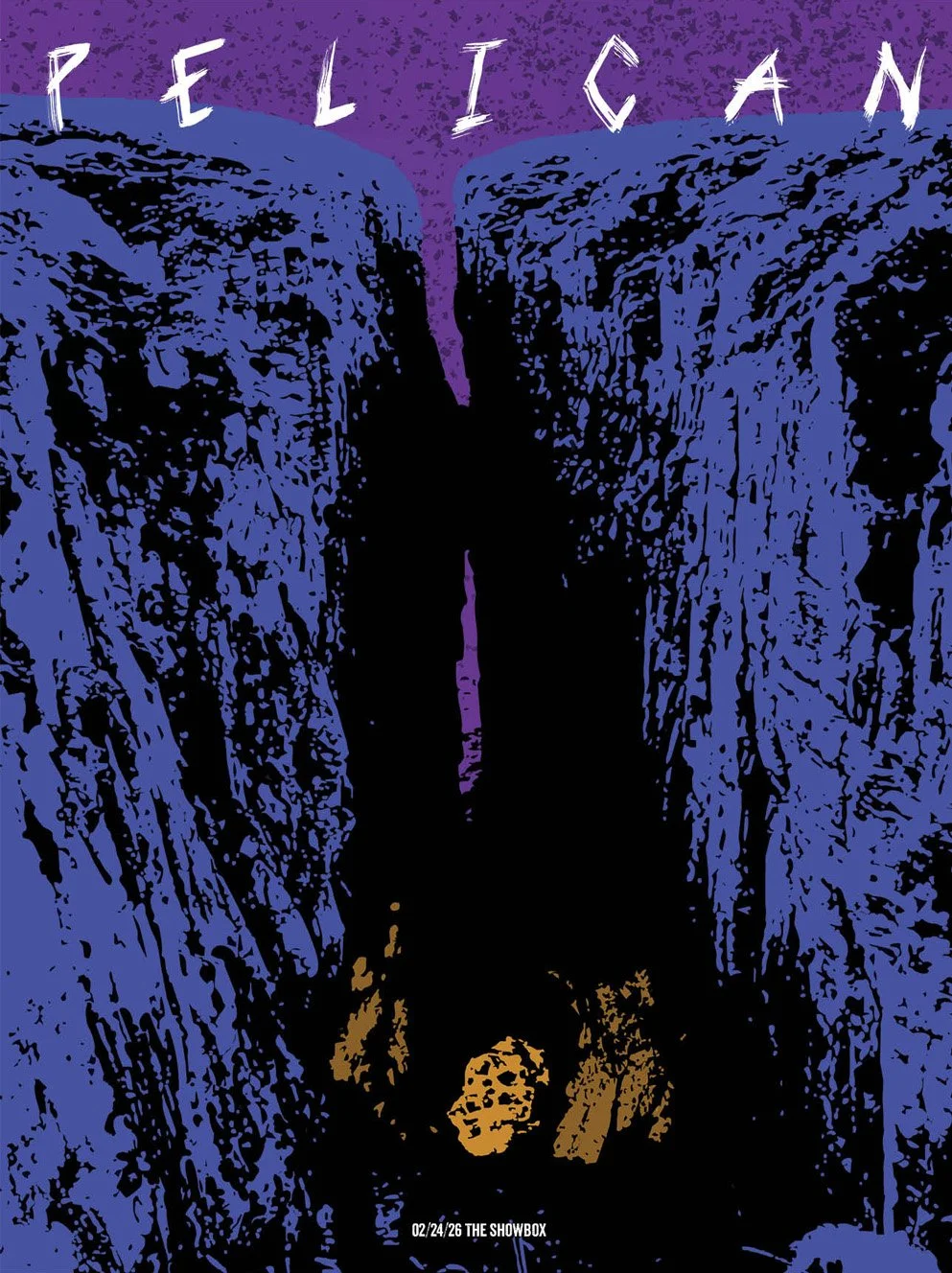
Gig poster for the melodic metal band Pelican. I wanted to capture the look and feel of the band’s music as well as their existing aesthetic. Since a lot of their imagery uses mountain terrain I wanted to capture a rocky scene. I also wanted to bring my own sinister twist to the look so I went with a chasm with a smoldering meteor at its bottom.
I needed to design a poster for the band Pelican, which I assumed would be a relatively easy assignment. I’m a fan of plenty of similar metal bands, and even though this one was unfamiliar, the genre has a well-established visual language.
The first surprise came when I listened to Pelican’s music. There are no lyrics. That meant no lyrical themes to pull from or build on. The second surprise came from their existing album art, which is primarily landscape photography and art, usually of mountains, and not what I would typically associate with the genre. The final surprise came from other posters created for the band. Nearly all of them prominently feature a skeleton. While that’s more in line with the genre, it isn’t in line with the band’s established visual identity.
Combining these observations, I settled on the approach of a “sinister landscape” and sketched a variety of caves, craters, and chasms. A major challenge at this stage was that posters are typically portrait-oriented, while landscapes want a format of their own. The composition also needed to be genuinely interesting, not just a cool shot. I eventually chose a chasm, which worked naturally with a poster’s aspect ratio while guiding the eye down the page.
The next challenge was texture. A generic rocky texture wasn’t enough; it needed to be gnarly, a quality that’s easier to find in organic material. I eventually found a downward-looking photo of a chasm in New York. The photo itself was sunny and almost inviting, but it had the proper angle and, more importantly, the texture I wanted. In Photoshop, I pushed the entire image to its most extreme black-and-white values and colored around the result, keeping the gnarly detail while stripping out everything I didn’t want. I then repeated the process with a meteor and additional rock walls to create the glowing meteor at the bottom of the chasm.
Why It Matters
Discovering that an instrumental metal band’s visual language is landscapes, not skeletons, and designing to that truth, is brand strategy in miniature. The execution demonstrates practical problem solving that transfers directly to professional work: reconciling a landscape subject with a portrait format, composing to guide the eye rather than just capturing a cool image, and building custom texture by pushing photographic reference to extreme values and rebuilding color around it. That last technique is a genuinely resourceful production method that shows an ability to manufacture the raw material a design needs when it does not exist off the shelf.
Process
Problem to Solve: Pelican is a melodic Death Metal band with its own unique look and feel. Design a poster that both satisfies Pelican’s unique visual language and remains appealing to fans of the genre at large.
Solution: Pelican’s art uses a lot of rocky landscapes and the genre has a larger artstyle that can be best described as “sinister”. To find mountainous landscape that fits the description I settled on a chasm looking down. I took just the shadows and highlights to really crank up the creepiness factor and added an orange flare at the bottom to draw the eye down the poster.
Research: I compared existing Pelican posters to their album art and listened to a lot of their music to find a visual tone that would best fit the band.
Solo Project
Tools: Photoshop, Illustrator, InDesign
Timeframe: 1 week (February 2026)
Process and Work: After research, I began by sketching different directions for the poster and receiving peer feedback. When I settled in the direction of the chasm, I needed to make the texture super gnarly to fit the tone. I accomplished this by taking extra craggy rock walls and converting the color grading to grayscale, then shifting the settings to extremes in shading and highlights until I had purely black-and-white pictures of just the rock texture. Then, I took the white spots and painted them over with the color I wanted.